I would chop the right side of the second photo off about where the post is
sticking up. I think the vertical format works well but I wouldn't crop as
tight as Moose. The lighter background of the second photo is better IMO.
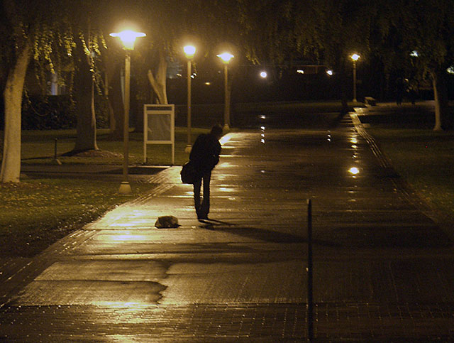
Apparently I'm the only one who thinks that guy looks too skinny to be a
guy. He/she looks like a young woman wearing high heel boots (or similar),
and is barely strong enough to carry the bag. The leaning to the right and
the trash on the sidewalk add to the picture.
-jeff
----Original Message Follows----
From: Moose <olymoose@xxxxxxxxxxxxxxx>
iddi wrote:
>which of the two do you prefer, and why?
>
>http://photos1.blogger.com/blogger/2425/1296/1600/IMG_1002.jpg
>
>
>http://photos1.blogger.com/blogger/2425/1296/1600/P2171301.jpg
>
>
The way the fellow is leaning way over to the right adds a question to
the image, the answer to which isn't apparent. That weakens it for me by
muddling the story. On the other hand, the placement of the piece of
trash really adds to the story I see.
I'd also try a tight, vertical crop to see what it looks like. Well, I
did, and I like th change of focus.
For me, both images suffer from the sign. I thnik it's better without.
If you can ignore the artifacts from upsizing a small, compressed file,
you can see what I'm talking about
<http://www.moosemystic.net/Gallery/Others/iddi01.htm>.
Moose
==============================================
List usage info: http://www.zuikoholic.com
List nannies: olympusadmin@xxxxxxxxxx
==============================================
|