Dawid Loubser wrote:
> Hi All,
>
> I am often a sucker for shooting Kodak TMX P3200 film, I just love the
> texture / tones. These are two fairly recent (snapshots?) ...
>
> OM-1, 24/2.0 wide open, 1/8s
> http://fc00.deviantart.com/fs48/f/2009/226/7/d/La_San_Marco_by_philosomatographer.jpg
>
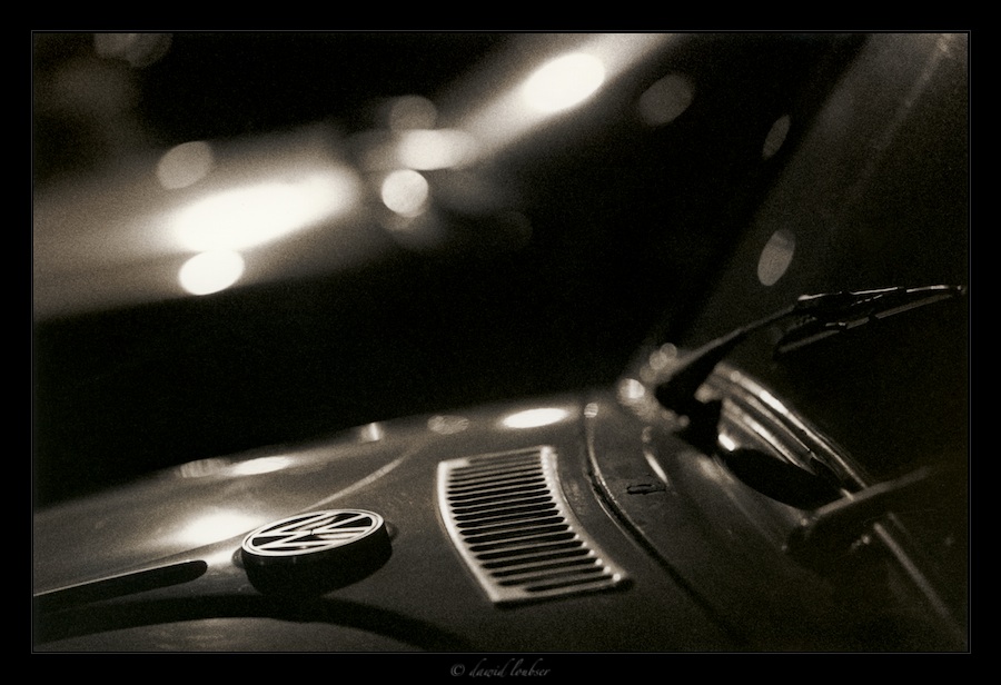
> OM-1, 90/2.0M wide open, 1/30s
> http://fc08.deviantart.com/fs46/f/2009/226/a/b/People__s_Car_by_philosomatographer.jpg
>
> ..., but they both illustrate an effect I love: Grain, together with good
> (smooth) bokeh. Somebody needs to invent a word for this (Bograin? Grainkeh?)
> but I very often strive to get the effect.
>
Neither of these is my favorite sort of image. Still, the second struck
me as a good example of its type. The first one, though has been bugging
me. I odn't much like it, but couldn't figure out why. I mean what's
not to like?
I think I finally figured it out, two related things, really. First,
the bright area in back is too bright for my taste, pulling attention
away from the rest of the image.
Second, in that same area, the "good (smooth) bokeh" isn't quite smooth
enough for my taste. The strong, dark lines have a slightly edgy quality
and the highlights on the lower left of that area are hard edged
circles, instead of soft, bright centers fading off with distance.
Nothing to notice in most images, but in this particular context, I find
it slightly jarring.
So I tried an alternate opinion version. The only "trick" was softening
the focus without losing the grain. I don't claim it's "better" than the
original, or have any particular expectation whether you will or won't
like the changes. Just an alternate viewpoint to consider.
<http://www.moosemystic.net/Gallery/Others/Loubser/La_San_Marco.htm>
> .....
>
> This is fun!
>
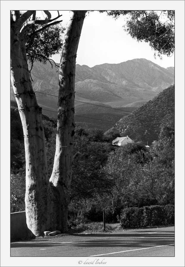
> P.S. A landscape with the 90/2.0 at f/8, shooting Pan F at ISO32. Here, I
> tried to embrace the
> typical "distracting" elements we usually strive to remove from our
> landscapes.
>
> http://fc04.deviantart.com/fs49/f/2009/226/5/9/De_Rust_by_philosomatographer.jpg
>
The "distracting" elements are OK, if so intended. It's the other parts
that bother me a bit. The focus and tonal differentiation seem to me
neither soft and dreamy nor sharp and distinct. Another alternative
opinion. <http://www.moosemystic.net/Gallery/Others/Loubser/De_Rust.htm>
> At infinity, the Zuiko 90/2.0 is nowhere near as good as Mamiya's 140mm f/4.5
> Macro (which I use a lot),
> which seems to be better over the full range of 1:1 to infinity, but it's
> still pretty darn good.
>
I know some folks must be tired of hearing it, but I'm still of the
opinion that the 90/2 is a good lens, but not a great one. Zuiko also
made a longer macro that I think is better than the 90/2, the 135/4.5.
It requires the Auto Tube or bellows, but is pretty easy to use even
hand held with the Auto Tube. The 100/2 is also reputed to be sharper at
distance, but I've never used one. I also rather like the Tokina
60-120/2.8, for sharp results and easy framing.
Moose
--
_________________________________________________________________
Options: http://lists.thomasclausen.net/mailman/listinfo/olympus
Archives: http://lists.thomasclausen.net/mailman/private/olympus/
Themed Olympus Photo Exhibition: http://www.tope.nl/
|