Dawid Loubser wrote:
> .... It was really more of a "let's see how this lens works, and if it can be
> hand-held" event than an inspired
> photographic outing, and in not great surroundings, but the light was, for a
> moment, quite nice during the rain.
>
> All of the images taken at f/2.0 (hand-held) shutter speeds usually between
> 1/125s and 1/500s:
>
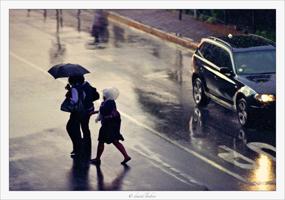
> http://fc06.deviantart.net/fs50/f/2009/320/9/b/Wet_Crossing_by_philosomatographer.jpg
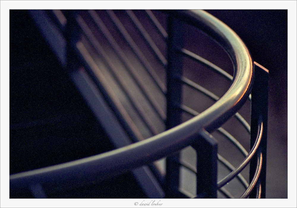
> http://fc04.deviantart.net/fs51/f/2009/320/3/3/A_Slice_of_Curve_by_philosomatographer.jpg
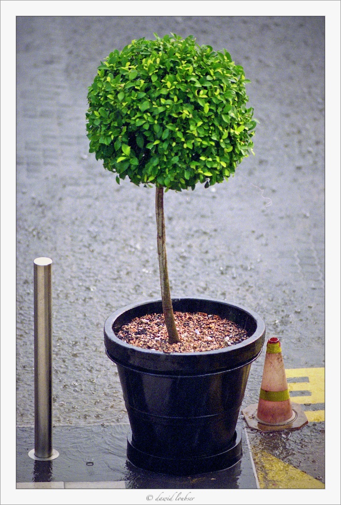
> http://fc05.deviantart.net/fs50/f/2009/320/9/4/Trim_and_proper_by_philosomatographer.jpg
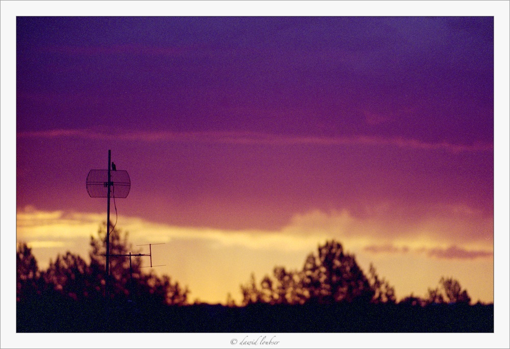
> http://fc06.deviantart.net/fs51/f/2009/320/3/1/Bird_and_Antenna_by_philosomatographer.jpg
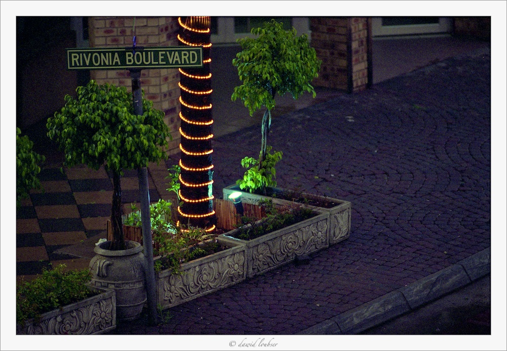
> http://fc09.deviantart.net/fs51/f/2009/320/4/c/Rivonia_Boulevard_by_philosomatographer.jpg
>
Quite good results for a learning outing in less that what are normally
considered easy lighting situations. The first two are my favorites, as
they work will with the strengths of the lens.
The tree doesn't work for me as anything more than a fine test subject,
partly because it's just not all that interesting a subject, but perhaps
primarily because I don't find the zone of focus deep enough for the
subject. At the least, I prefer sharpness of spherical objects like that
to extent all the way to the front. I actually did some experimenting
with dandelions to find what pleased me in DOF and depth location of the
sharp zone.
Bird and Antenna is a fine test subject, too. Now that I've seen a a few
images from this lens, I can see that bokeh isn't a general problem, but
does get a bit rough in some circumstances. I didn't much like the bokeh
in the right background of Bert's Boat and can't say I much like it
here, either. Just lovely bokeh in the first two.
Rivonia Blvd. is another nice test, but the DOF isn't sufficient for my
taste.
> ...
>
> Hmm - 35mm colour print film at ISO 800 is extremely grainy, but not too
> bothersome for most modest print sizes, I must say, and I quite like the
> subdued colour hues.
I agree about the colours, very suitable for the subjects. As to grain,
I tend to like it less and/or less often than others here. I
particularly like the first two images without so much exactly because
of the wonderful smoothness of the bokeh in them.
Curve, in particular, is to me so much about the smoooth way focus
slithers into softness. The sharpness of the grain is jarring to me in
that context. <http://www.moosemystic.net/Gallery/Others/Loubser/Curve.htm>
It's a little less an issue for me with Crossing, but I do much prefer
the look of the background reflections without the edginess of grain.
<http://www.moosemystic.net/Gallery/Others/Loubser/WetCrossing.htm>
Moose
--
_________________________________________________________________
Options: http://lists.thomasclausen.net/mailman/listinfo/olympus
Archives: http://lists.thomasclausen.net/mailman/private/olympus/
Themed Olympus Photo Exhibition: http://www.tope.nl/
|